
Announcement Time: We have a new and improved BLOG... so that means we won't be updating this one any more. Don't worry this blog won't self destruct or anything. It'll stay right here for your viewing pleasure should you want to reminisce. To continue on with our story, click on the link below:
http://www.garyandcourtney.com/blog/
Make sure you bookmark the new blog's web address (as it has changed significantly from the old one) and check back often for weekly updates. Cheers.
Hello There & Welcome

- We're The Christensons
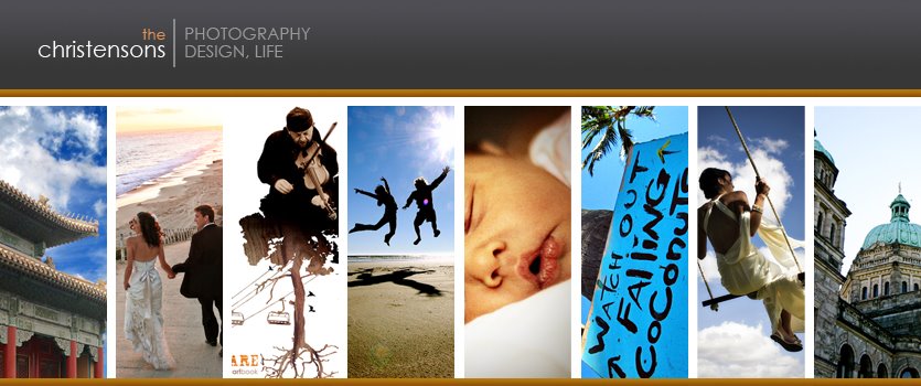
- This blog reveals stories and imagery from our professional work and personal adventures. We are creative portrait and destination wedding photographers that live, work and play on the west coast of the US of A. We also run an award winning graphic design studio. But more than that, we’re a young abstract family trying to live this life to its absolute fullest. As you look through some of the blog entries below you will get a good feel for what makes us tick, and you’ll be introduced to some of our latest design and photo projects. Check back often for updates, and if you see something you like don’t be afraid to leave a comment.
Showing posts with label Design. Show all posts
Showing posts with label Design. Show all posts
Tuesday, April 07, 2009
NEW BLOG
Monday, February 23, 2009
emote360 projects

 Photography by the always amazing Ben Edwards of emote360.
Lately I've been busy designing some really sweet items for our emote360 clients. Hop on over to the emote blog to see what's been happening lately. We have four really great projects happening right now and we're anticipating a few more projects in the near future, as well as a couple emote360 trips to Africa in the next 6 to 9 months. I feel completely blessed to use my designing gifts in this way... doesn't get better than this.
Wednesday, February 04, 2009
Client: Connexion
![]() I wanted to share an interesting process I recently went through on a Branding project with a client. The company is a high end Print Consultant Firm called Connexion. Most people think that graphic designers come up with a logo in like 15 minutes and it's some mindless Typeface and Icon to quickly slap on a website or product. But in fact, an educated designer has a lengthy process that will ultimately flush out a unique branding solution that will give the client an edge in their market. My process always begins with me spending several hours trying to really get into the clients head... How does the founder feel about their company? What does it mean to the consumer? How should it speak to them? What sets this company and its product apart? If it was an animal, which would it be?... well, not that last question :) but I basically flush out any information that will help me come up with some creative concepts for my clients image.
I wanted to share an interesting process I recently went through on a Branding project with a client. The company is a high end Print Consultant Firm called Connexion. Most people think that graphic designers come up with a logo in like 15 minutes and it's some mindless Typeface and Icon to quickly slap on a website or product. But in fact, an educated designer has a lengthy process that will ultimately flush out a unique branding solution that will give the client an edge in their market. My process always begins with me spending several hours trying to really get into the clients head... How does the founder feel about their company? What does it mean to the consumer? How should it speak to them? What sets this company and its product apart? If it was an animal, which would it be?... well, not that last question :) but I basically flush out any information that will help me come up with some creative concepts for my clients image.
So in the logo brainstorming session, the client wanted to incorporate a principle known as the Golden Ratio, that he felt helped describe his business. It's quite remarkable once you start looking into this principle. It's an equation that's been used by artists and engineers from as far back as the Egyptians, if not further back in time. It's believed to be the most aesthetically pleasing proportion. It's principles can be found in most anything in the physical universe... pretty crazy stuff.
So we explored the idea and incorporated this principle into the arms of the "X" in their company name (also making it their Icon or "Brand Mark"). The Golden Ratio will exist in the design of the website as well as other marketing materials. It was really interesting to me and fun to explore as a designer. Other words that I pulled from to create this brand: Intelligent, Diversified, Attentive, Nimble, Expertise, and Context. Overall the logo is modern & professional, and fits like a glove.![]()
Friday, January 09, 2009
Wedding Albums
 Just got more albums back from our printer! One 11x14 Bride & Groom Album and two smaller Parent Albums. We stankin' love these things, and are still convinced that this is THE BEST way to display photos. They're so style-ee & b-e-a-utiful, and it definitely gets a crap load of attention... just like our daughter - we'd pretty much describe Joelle that way too :) Have a great weekend everybody!
Thursday, January 08, 2009
Client: OLC
 Just finished up a BRANDING overhaul on a natural resources company called Oregon Lumber Components. The vision for this logo was a mixture of a few concepts:
1) Traditional Values meets Forward Thinking - Since they've been in the industry for several decades now, they wanted something that would show their heritage in the industry, but also help establish themselves as leaders for the future of earth-friendly wood products. So I brought in a fresh green & charcoal color scheme, accompanied with a serif font that give a "foundational" look to their logo. And then I created an icon that shows "forward thinking" and "conservation of natural resources" through recycling their products (round it goes).
2) Eco Friendly - the main product they produce is a massive collapsible shipping container used for food and liquid transportation on a world market. This shipping "box" is better on the environment than their competitors products and it's completely recyclable once the product has been used).
Overall, OLC is a really innovative company and I think the new brand accurately represents who they are and where they are going in the industry.
Wednesday, December 17, 2008
NEXT T-shirt Designs
 A couple apparel designs for World Relief NEXT. They wanted something a bit more edgy & messy to accompany their other shirt design with just their logo on it (not shown). This way they can have one styleee shirt for you to wear, and one normal shirt for your mom to wear... hee hee, your mom :) So everyone can be happy. And the best part, these puppies are only 2 color... so they can save some $$$ on printing and purchase a great quality T to print on. Non Quality Tees suck at being worn.
Friday, December 12, 2008
World Relief NEXT: Congo Part 2
 Here is the booklet I recently designed for World Relief NEXT (through emote360). The piece feels great, looks dynamic, reads well and is very compelling. We also did a little handbill (Part 1) to drive folks to they're display table for their launch. We're excited to partner with these incredible people, and we're stoked to assist them in bringing positive change to this world.
Wednesday, December 10, 2008
World Relief NEXT: Congo Part 1
 Just received our first Congo print piece (Part 1) for the launch of World Relief NEXT this weekend. This particular handbill will be used to drive people to the NEXT display table where they can purchase a 16 page booklet I designed (Part 2) that will also have a handmade bracelet attached to the book. Proceeds from this product will help fund relief projects in Congo. It was a blast working with World Relief NEXT on these print projects. Looking forward to the future projects emote360 has lined up with World Relief NEXT.
Tuesday, December 09, 2008
Love Project
 Helping my favorite bro-sephs at Love Project Maui with some designing goodness. A few print pieces for one of their latest projects. See you guys in Feb!
Friday, November 21, 2008
Print Piece: Emote360
 We've been "busting our chops" (whatever that means) on emote360 stuff lately... we've basically started a small movement that we named Schmooze-Fest 2008 ("schmoozing: to chat in a friendly and persuasive manner especially so as to gain favor, business, or connections"). We've been attending meetings, chamber of commerce events, non-profit forums and all that crazy stuff. I secretly hate doing all the salesman stuff, it's pretty far out of my comfort zone, but we gotta get the word out somehow. So in order to properly schmooze, one must have something to handout to help inform (along with our b.cards of course), or as the biz calls it: "a leave-behind or handbill of sorts"... so we've been making some pretty sweet print pieces for emote360. We may suck at being salesmen and we don't have a sales strategy of any kind, but at least all our materials look slick. This particular large print piece has a nice heavy stock, die-cut corner, basic info on the back and some selective UV coating just on the logo and text... the little details make for an overall great impression.
Thursday, November 13, 2008
Emote360 Pic's + Launch
 Ben and I took some emote360 staff pics yesterday. The first series of images say "Trust us, we know what we're doing", the second shots say "We view things a little differently", and the third image says "We're secretly gorillas"... look at those lips, too funny. Or it could mean "We get punched a lot, and this is what it would like in slow motion"... whichever you prefer - tomAtoes tomOtoes. I had a mentor tell me to "Never take yourself too seriously" and I'm still livin' by it. In all seriousness, tomorrow officially launches the beginning of emote360. Please check out our New & Improved Website and Blog. We're stoked to start providing a solution to help nonprofits meet more real needs, and on a global scale.
Website: http://www.emote360.com/
Blog: http://blog.emote360.com/
Thursday, October 30, 2008
emote360
 Courtney and I are co-founders of a non-profit organization called emote360, and it is time to start giving it our undivided attention. "What in the world is emote360?" you ask. Well, lets fill you in!
Emote360 is a global non-profit media group based out of the Pacific Northwest, USA. Emote offers custom multimedia solutions for non-profit organizations who are in need of video and audio production, graphic design, photography, web design and media management consulting. Emote works exclusively with registered Non Profit organizations who are in process of obtaining their 501(c)3 status. We at emote believe our services don’t just stand upon a great price; we’re offering media that raises the bar in its quality and meaning.SUMMED UP without all the technical jargon: "We exist to help non-profits generate more income, to ultimately further the work that they do on the ground." It all boils down to finding nonprofit organizations more moo-la. We just happen to utilize multimedia to get them there. We create multimedia materials that will enable nonprofits to spread awareness for their cause and in return raise donor support. It's pretty simple... but for most nonprofits, understanding and utilizing media is a daunting task that few handle well... so we're here to help.
Emote360 has been almost 2 years in the making, and we're stoked to be meeting needs on a global level. Emote artists have already been to countless countries around the world, and we're returning to India in January for another project. We're also very interested in telling the story of media professionals who are giving back, and to challenge other talented media folks to use their gifts to give back in a meaningful way. Over the past 3 months we've been blessed to assemble a dynamite board of directors (industry leaders in photography, graphic design, law, community development, global relief work... etc) and we've also created a core-team of media professionals who are already whipping out emote projects. Exciting times ahead! We'll keep you all posted through the emote BLOG. Can't wait to see what God does with emote360, we're just along for the ride!
Website: http://www.emote360.com/
Blog: http://blog.emote360.com/
Friday, October 24, 2008
Client Website: Tetherow
 Before the weekend arrives in all of its glory, I wanted to quickly share a bit about a project I'm on as a designer. The images above and below are just brief screen captures of the art direction I've created for a dynamic flash website for Tetherow (the folks at Tetherow are THE best). Basically, it's a full screen, interactive, media heavy, top of the line website to SHOW who Tetherow is, without having to use too many words... verbiage is out, imagery is in - it's the new black :). We've been on-location over the past few months gathering photo & video content with helicopters, cranes, audio & video teams, cameramen... to get the media we need to display all throughout the website. Anyways, it's going to be the pinnacle of our work all wrapped up into one gorgeous (and extremely simple to use) website. It's ganna take some time to complete, but so far everything is coming together quite nicely thanks to the always wonderful Melissa over at Tetherow. I'll keep you all posted on the progress, I'm stoked to be involved in this project.
Click above image to view larger
Tuesday, October 14, 2008
Emote360 in ProPhoto Mag
 Emote360 and Kevin Kubota have been featured in this months issue of Professional Photographer Magazine. Go ahead and pick up a copy at... places where you'll find magazines :) ... Barnes and Noble or your local 711 - I dunno. The article is near the end, pg 146, in the "Good Works" section, titled "Building A Future" - highlighting an emote360 trip to Rwanda with Ben Edwards & Kevin Kubota (named one of the top 10 photographers in the world - ALSO an emote360 board member - which is waaaay cooler :). It's a pretty sweet spotlight for emote360 as things are just getting underway for our organization. By this time next month, we'll be opening our doors for service. Exciting times! I'll post more info on this blog in a few weeks to help you understand who emote360 is (a nonprofit media company) and what it will accomplish (help other npos with their media needs), and our role in co-launching this organization. Stay tuned.
Wednesday, October 08, 2008
OUR BLOG: Cleaner, Newer, Fresher
 Hey all, with some down time on our hands, we cracked some serious html code and made some improvements on our blog. Here's just a few of the added features: 1) Increased the width of the blog to showcase more content, 2) Made the pictures HUGE for your viewing pleasure (you can still click on any image to view it even larger, but it's okay to be lazy every once in a while - we understand), 3) Added a sweet flash widget for Twitter (it's addicting, but man it's fun to know what friends and family are up to on a regular basis - JOIN IT), 4) We cleaned up the orange sidebar on the right for easy navigation to our website links and our older blog posts, 5) Took away that annoying Blogger Navbar, 6) We have less blog entries per page for faster loading - so to see older content on other pages, simply scroll down to the end of this page and click "Older Posts" 7) And we added a Welcome Message to introduce people to the blog and why it's important to us. In all, I like the changes and think it makes it more functional and efficient... which fits my personality to a "T" - I come across as a low key guy, but really I'm as high strung as the "Highest Octave G String" on a 12 string guitar :)
Monday, September 29, 2008
Client Website: PRB
 PRB, a nation-wide natural resource company that I branded a few months ago, has their brand spankin' new website UP & LIVE - I designed this flash site for them and Peter from LJ3 Media coded it all up... he's basically a genius! I also did a majority of the photography that is represented on the site. Check it out at: www.pacificresourcebrokers.com They've been awesome fellas to work with... so down to earth! We wish them the best with PRB.
Wrapping Things Up
 I've been finishing a few remaining design projects at antioch before my time here comes to an end. Today is sadly my last day. It's been a great year working part-time with antioch as their Creative Arts Director. Court and I are steppin' out in faith and praying for the best with the biz (photo+design biz and the new emote360 venture). Courtney will be able to stay at home with the baby and just do a few hours of work a day for the biz - mainly coordinating all the photography stuff (she'll have the hardest job of them all, being a MOM) and I'll continue to work full-time out of my office space on the north side of town. So keep our finances, our biz ventures and most importantly our little family in your prayers. Thanks much-o.
 Quartlery Journal Logo (vintage tatoo inspired)
 Kids Ministry Art Book Cover (love texture:)
 Sermon Series Design (clean and simple)
Thursday, September 25, 2008
Branding: Apologetics Conference
 Just got done BRANDING an Apologetics Conference that J.P. Moreland is coming to speak at. I loved the phrase they used in our first meeting to describe what they were looking for in a brand: "Something where Old World meets New World." So to get the desired result, I brought in a muted color pallet, mixed two different fonts together, created a rustic cross for their brand-mark and threw in some random textures. I will also be apart of a media team who will be documenting the event (HD Video, Audio and Photography) for next years marketing materials. What a great client, they gave me a lot of creative freedom, and it was a true pleasure to set the tone for the future of this annual event.
Wednesday, September 03, 2008
Designing Pain
 I just wrapped up a few design concepts for a new sermon series at antioch. It's starting this week and titled The Problem with Pain. It'll be out in DVD/CD after it's all complete. Should be a good issue to tackle for a lot of folks dealing with this "ultra-fabulous, on the rise and almost back to normal" economy. (in case you didn't get the sarcasm, our economy = suckage :) Tell all the folks that are foreclosing, bankrupt and without work that we're not in a recession.
Wednesday, July 02, 2008
Art Book is HERE
 The ART BOOK(s) has arrived in all of it's glory. Its sitting in huge boxes waiting for its release date... July 20th - in the evening. The Art Book Reception is going to be sweet! We're going to be highlighting various contributers, displaying the original art pieces from the painters, sculptors, and photographers. We'll also have some open-mic time for the folks who wrote poems and short stories. As well as open-mic for some of the musicians who entered lyrics. Looking forward to celebrating... it took a long time and lot of work to get this puppy done! Facts: 189 pages & 36 featured artists ...
Subscribe to:
Comments (Atom)